Medical
Web App Redesign
Industry
MedTech
Activities
Usability evaluation, CJM, UI design
Task
Redesign existing providers web app to enhance usability and establish consistent UI
Overview
Problem
Miiskin's providers platform is a web portal that enables doctors and their staff to view patients' requests and review them by providing a treatment plan.
Inconsistencies across various sections of the product posed challenges during efforts to develop new features or scale it.
The before
Elements of the interface before redesign


Challenging factors
Improving usability within the set constraints
Limited user access
Due to the busy schedule of medical providers in US, securing user testing sessions with end-users proved to be challenging. I had to adapt to receiving user feedback indirectly through the commercial officer, primarily in the form of business requirements rather than user insights.
Limited Server Resources
The system encountered challenges in facilitating real-time auto-updates, including embedding message updates or notifications. Consequently, providers had to manually refresh the page to view new updates, necessitating acknowledgment and workaround strategies.
Small number of users
The drawback of developing a product with fewer than 20 users on average is that it becomes nearly impossible to gather statistically significant analytics data.
01. Discover
Usability evaluation
In the absence of direct access to users, I conducted a heuristic evaluation to discover problem areas of current design.

I identified several critical issues that could potentially lead to serious problems, although the majority of issues were of medium severity. This assessment of severity could aid us in prioritizing necessary changes. Additionally, I found that the weakest areas of the interface were consistency and adherence to standards, as well as user control and freedom.
02. Define
CJM
Conversations with the business team, who interact directly with users, motivated me to map out the providers’ journey on our portal.

Key areas of improvement
Consistency of UI
Usability evaluation proved that consistency and standards component of current platform's usability has the largest amount of issues.
Flexibility and control
Allowing medical providers to customize their communication to a patient is the key to high-quality care. The interface has to allow various payment and messaging settings.
Ensuring scalability
Miiskin continuously evolves to meet new medical requirements, necessitating a flexible information architecture for seamless scalability.
03. Develop
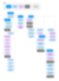
Information architecture
Designing with scalability in mind.
Identifying one of the challenges with the existing system was its limited adaptability to accommodate new features. For instance, integrating messaging functionality within the current portal structure posed difficulties. Consequently, I proposed constructing an information architecture map encompassing potential future features. This approach facilitated strategic planning of product updates, minimizing the need for extensive redesigns to accommodate new functionalities.
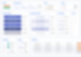
The solution
Sleek & Minimalistic Dashboard
-
Clear overview of recent care requests
-
Notifications for provider navigation
-
Easy access to user guide and helpful tooltips
Enhanced Provider Control
Introduction of new features:
-
Ability to review requests without requiring payment.
-
Implementation of draft-saving functionality, particularly beneficial for MAs and nurses for pre-filling documentation.
-
Integration of follow-up reminders to improve patient retention.
Patient-provider messaging
-
Enabling access to additional patient information (photo and textual) upon request.
-
Improving patient retention by providing chat support for 7 more days after the request has been reviewed.
04. Deliver
UI kit
Components library to optimize the teams' work
The components library was beneficial for both the product and development teams. It enabled us to enhance the platform's UI consistency and save time and resources.
Educating users
PDFs to inform users about the new features
To inform medical providers about the new features added to the platform, I created a PDF file for each update. This served to educate them and maintain ongoing communication, while also highlighting the progress of the product to our users.
Built-in resources library to help users.
-
Providing accessible video guides tailored for users.
-
Offering additional information for users interested in delving deeper into the nuances of the system.